Reviving an under-performing rewards program
AT&T THANKS is a loyalty program that provides existing customers access to exclusive offers and exclusive experiences. We were approached by the AT&T THANKS team to provide design insight to achieve three goals: Improve awareness and understanding of the THANKS program, increase redemption for select offers, and drive authentication of the THANKS program site.
Client
AT&T Thanks
Skills
Heuristic evaluation + Strategic thinking
Highlighted Tools
Sketch
Finding pain-points and opportunities
Without knowing why it wasn’t working currently, it’s hard to know why it wouldn’t work in the future, so the first step was to perform a heuristic evaluation of the existing site. Due to the complexity of AT&T, I decided to expand the evaluation to include the entry points for the program as well. I wanted to create a solid foundation for us to launch into problem-solving.

Working within limitations
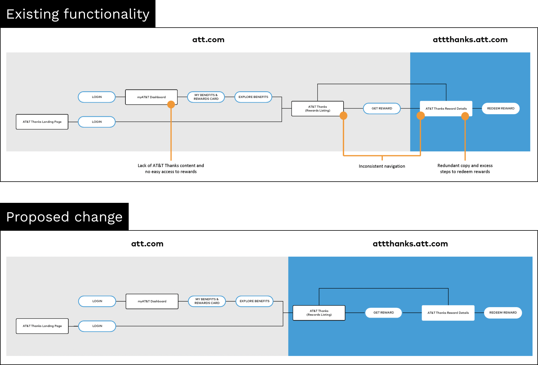
One of the biggest pain points that came out of the heuristic evaluation was the content structure and general functionality. Our proposed solution would allow the AT&T THANKS team more ownership of their own program content, reduce the number of clicks for offer redemption, technically control for the team’s content updates, and the opportunity to gain more learning through site analytics.
What we proposed was outside the AT&T THANKS team’s capabilities at the time, so as a result we needed to quickly pivot and rethink our approach.

Developing interim solutions
By working with the client to find interim solutions, we could help the client position the team into a place where we could push for greater change in the future. We established the boundaries we had to work within in order to be able to make informed design decisions that would make the most impact.

Utilizing existing spaces and elevate entry points, such as the user dashboard, will better facilitate user entry into the program.

Removing dead ends by making the navigation on reward details pages functional – this allows users fully explore the offerings instead of dropping off without understanding the full benefits of the program.
Proposing an uplift
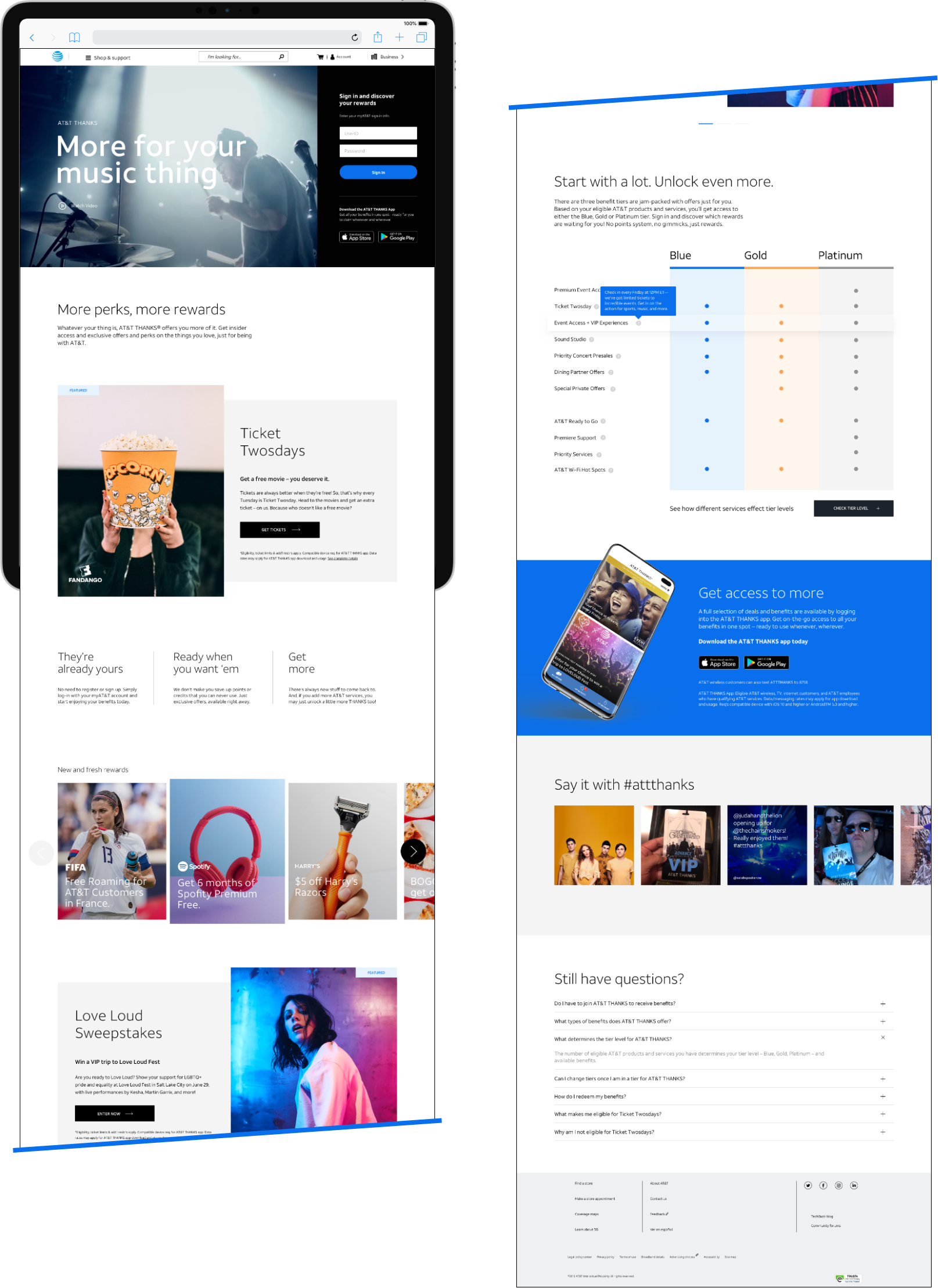
In addition to the small optimizations with the existing experience, we proposed a full redesign of the landing page to:
- Update content on the current landing page to better educate users.
-
Show previews of actual awards to encourage engagement and app download.
- Reduce friction for online rewards redemption by presenting them on the landing page.

Good feelings
The AT&T Team felt the interim solutions were a great way to start bolstering the AT&T THANKS program. They appreciated our big-picture thinking and our willingness to work with them to find a way to take the initial steps to achieve the end goal. This project continues to be an ongoing effort to find ways to optimize the existing AT&T THANKS journey through small design and copy iterations. In addition, we hope to flag possible areas of where other AT&T teams could update their designs in aid of the AT&T THANKS program.
