Designing for EarlyBird communities – their users and employees
Finance can be intimidating for parents; they want to be able to not only provide for their growing family day to day but to also plan for their future. I lead the design of a new feature: Moments. A new experience to bring the human connection to financial secruity.
I have also included how I cared for my greater team through various efforts including utilizing my unique skillsets and establishing internal processes.
Team
EarlyBird
Skills
Design leadership + Team Processes
Highlighted Tools
Figma, Notion
What is EarlyBird?
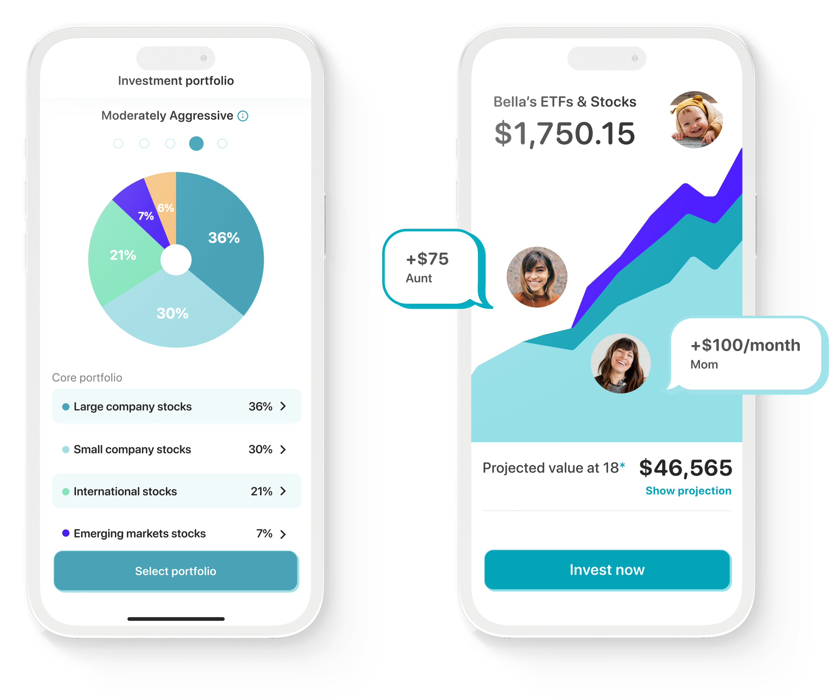
At its core, EarlyBird is an investment app that facilitates parents opening long-term investment accounts on behalf of their children. The unique magic of EarlyBird is its vision to marry two typically very different product experiences, finance and community. Through creating a community within the app, it can empower parents to build their children’s future investments with the help of contributions from friends and family.
Learning the landscape
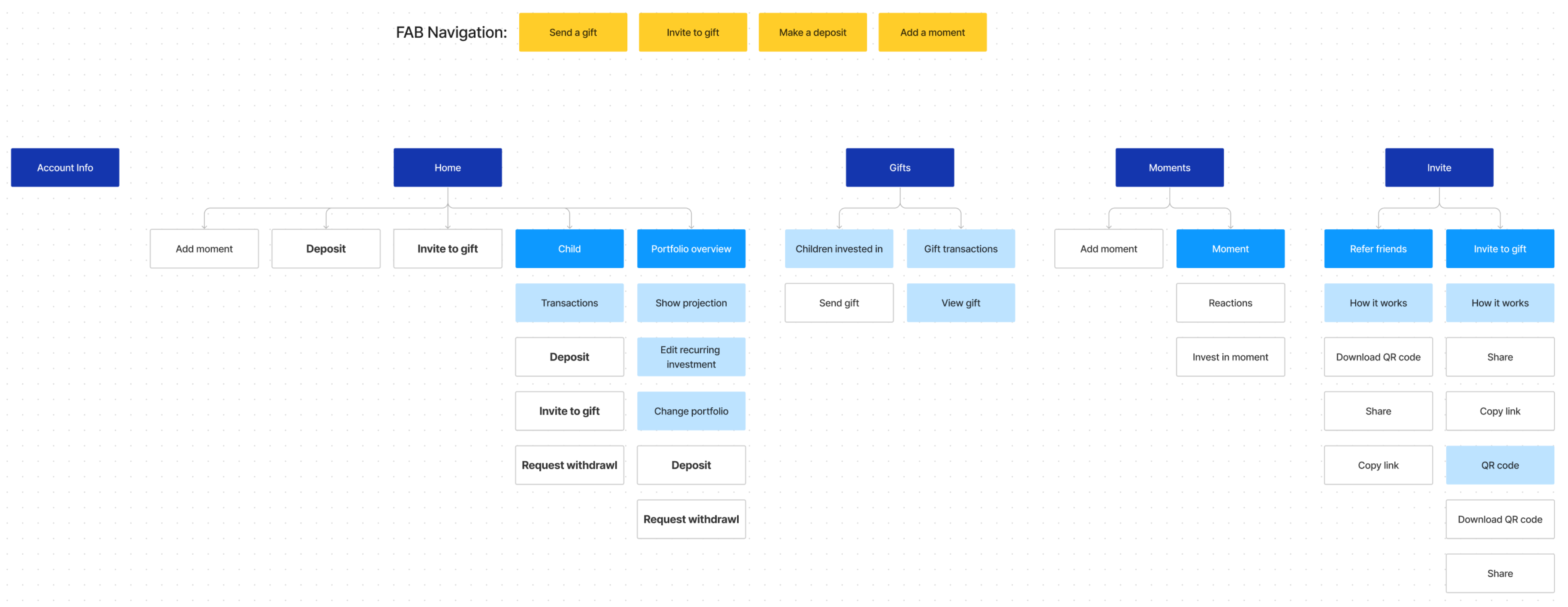
Joining a small team that had been operating out of need meant that they didn’t have the luxury of time to have built documentation of their app structure. My onboarding included creating documentation as I learned about EarlyBird’s app and team.
Starting with optimizations
The design files started off as one large Figma file. By starting my work with optimizations, it allowed me to become familiar with the designs all while splitting files into manageable sizes according to features and functions.
The new feature
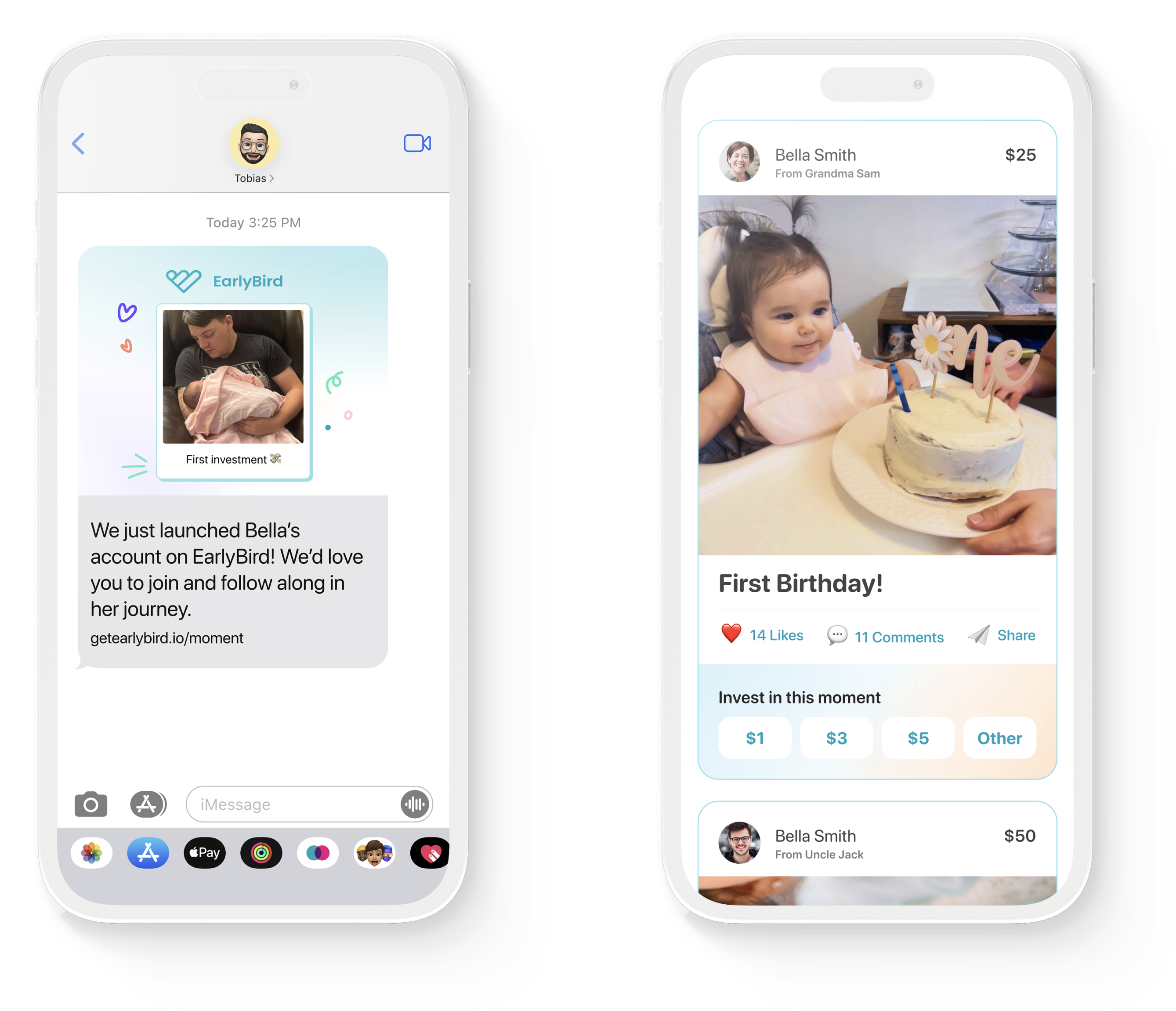
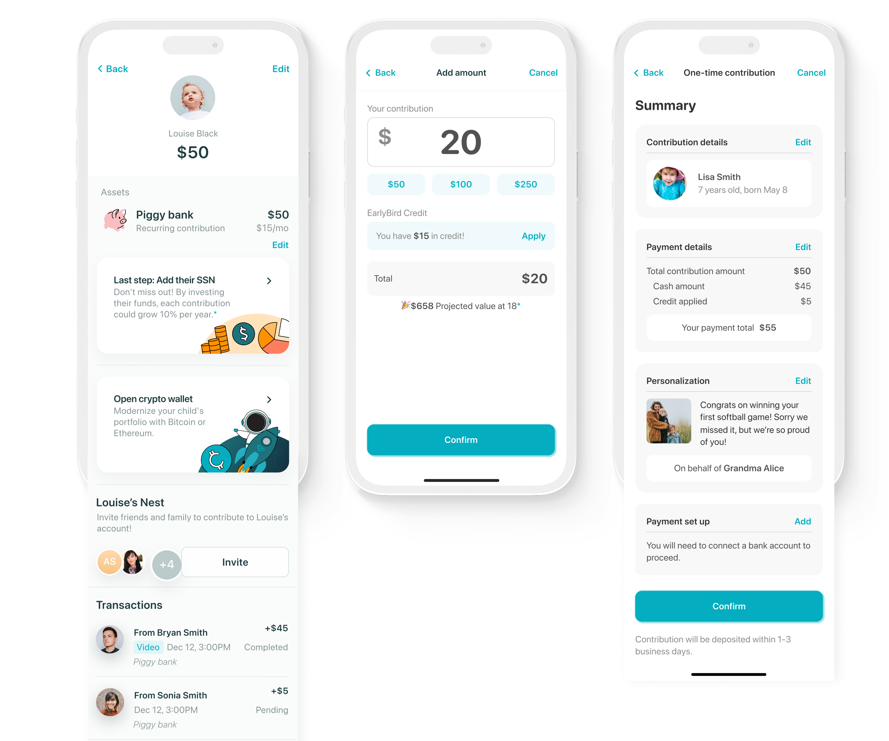
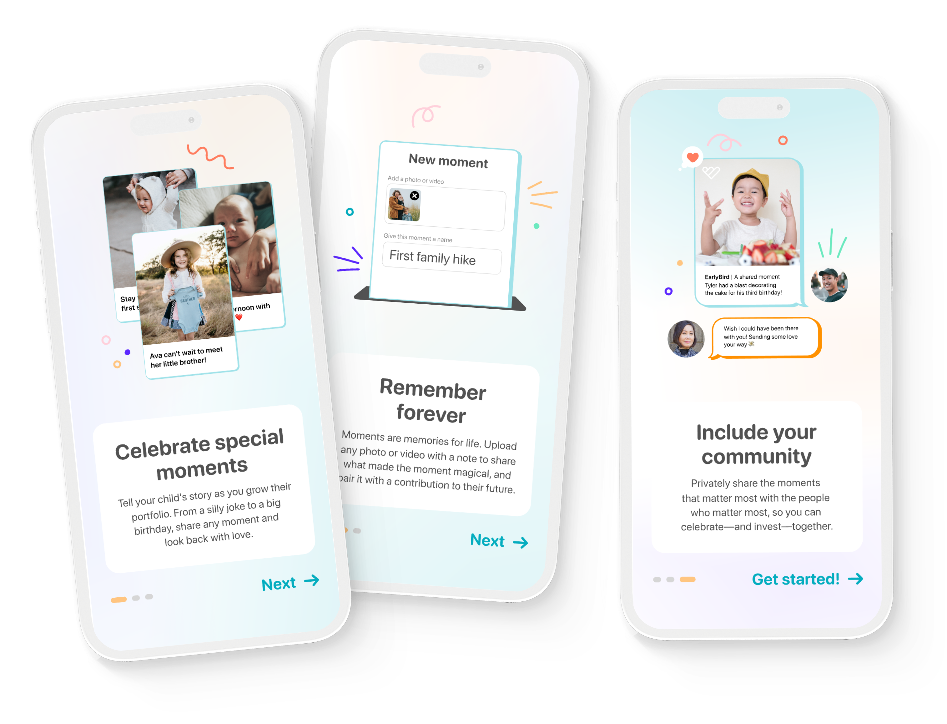
Moments allow parents to take their memories and stories to not only look back on with their children but to share with friends and family. I lead the design of this feature and since launching in Aug 2022, there was a ~7x increase in weekly parent engagement.
Ideation
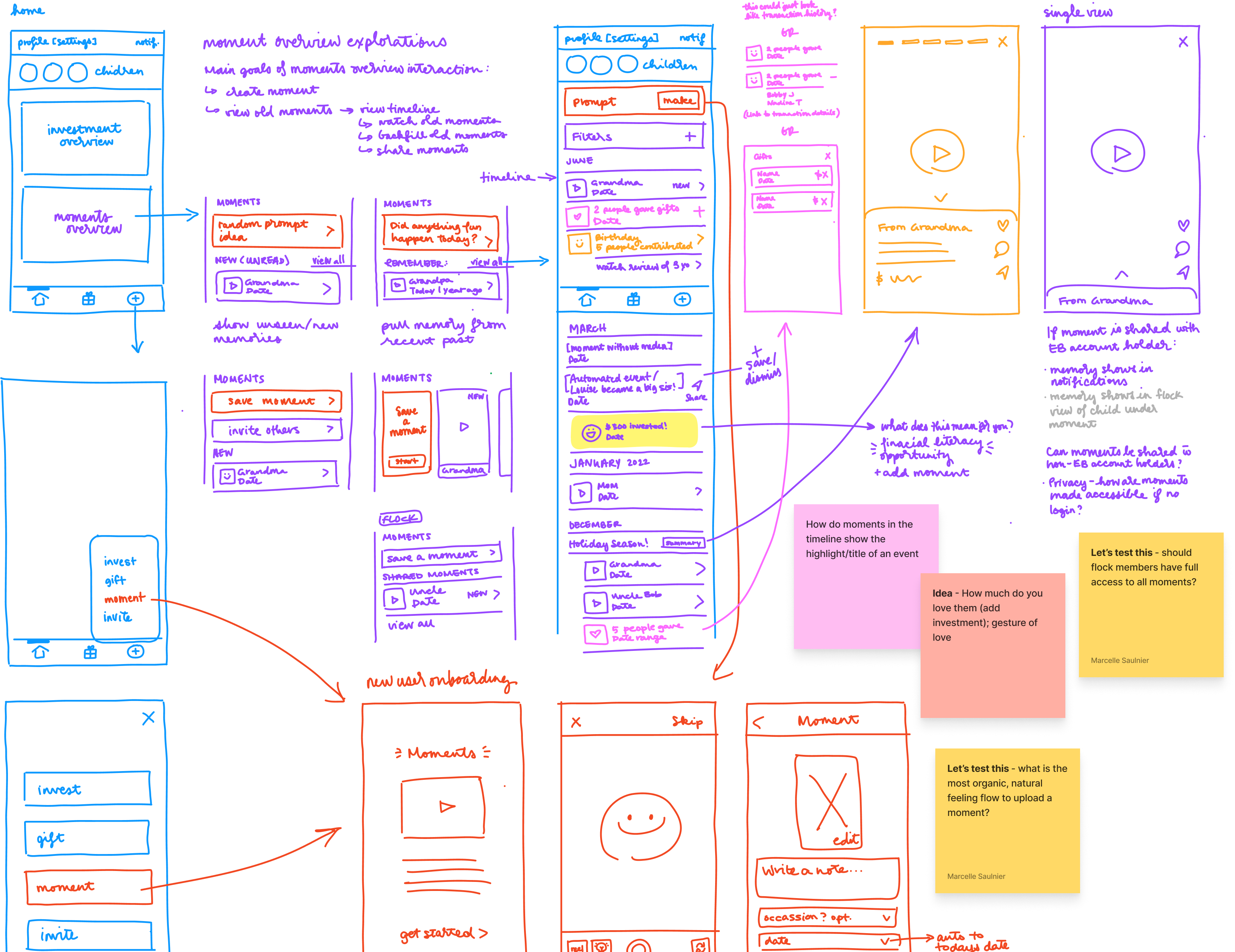
With new features, you can dream big, but you also need to figure out how it fits into the existing framework. Sketching new concepts is a fast way to discuss entry points, interactions, and rough UI plans for all the new ideas you cook up.
But of course, be informed
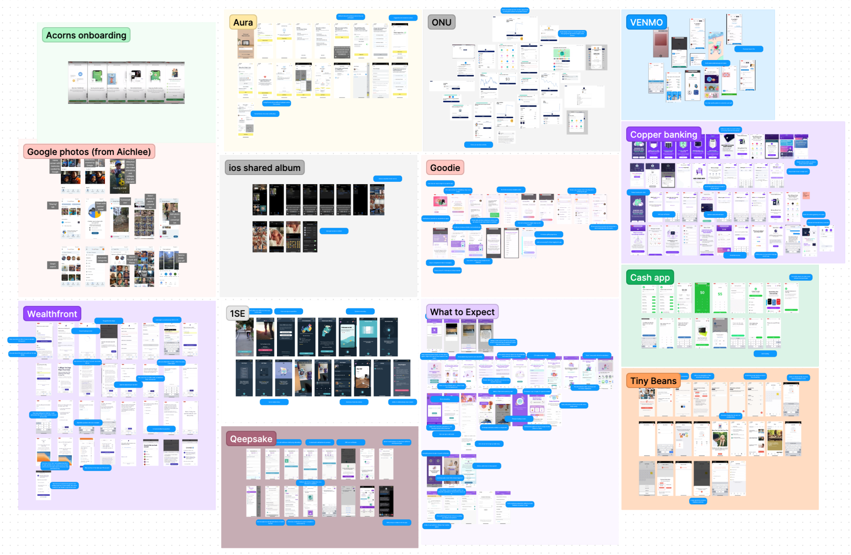
It’s always a good idea to do some competitive analysis, because why wouldn’t you. I always like including apps outside direct comparisons with parallel functionality and UI.
Also, with our sketches – turned wireframes – we took our concepts into user testing to get early feedback.
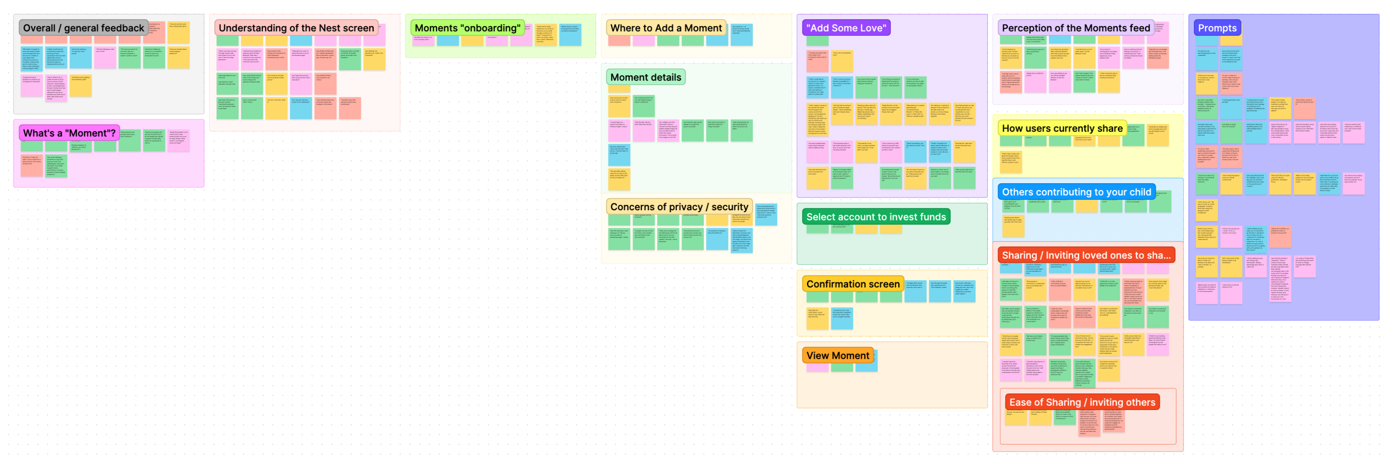
Synthesizing user feedback
User interviews were conducted and I collaborated on synthesizing and translating feedback into user needs and features. The results helped inform the prioritization of features and how we would plan the incremental design approach.
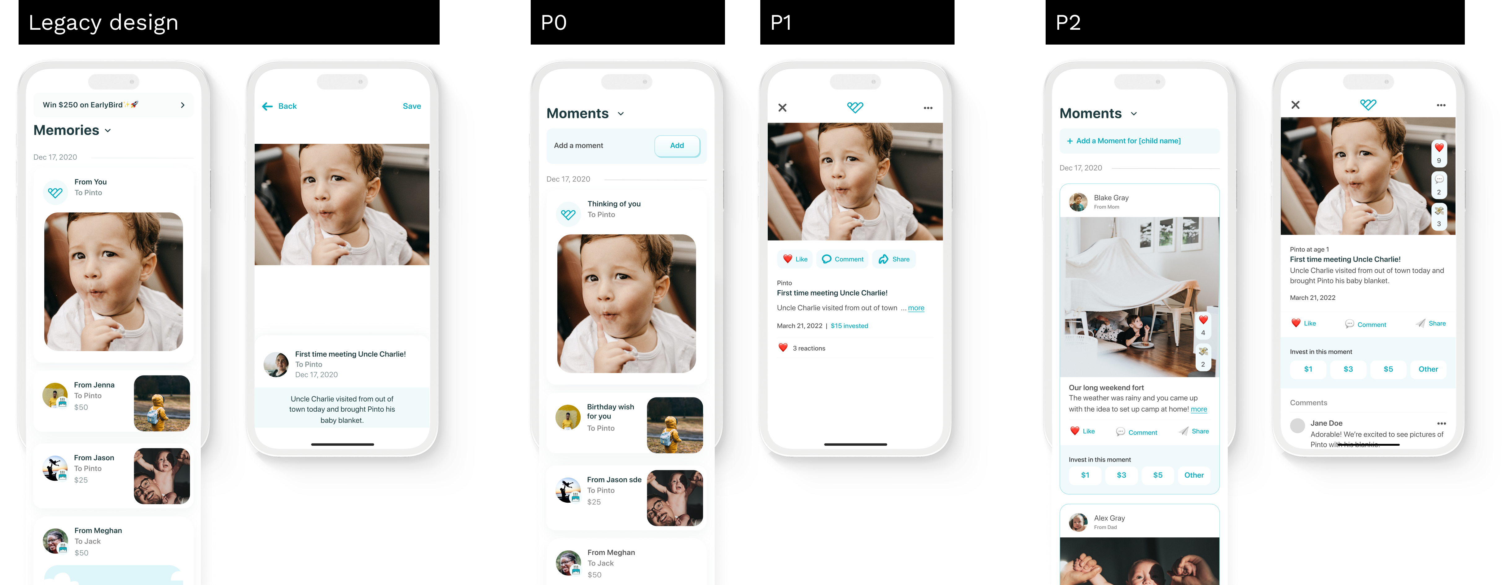
A phased approach
Time and practicality calls for agile and incremental updates. Working with the business and engineers, it’s a dance of priorities – what to focus on first, and what can be released later.
Elements of Moments
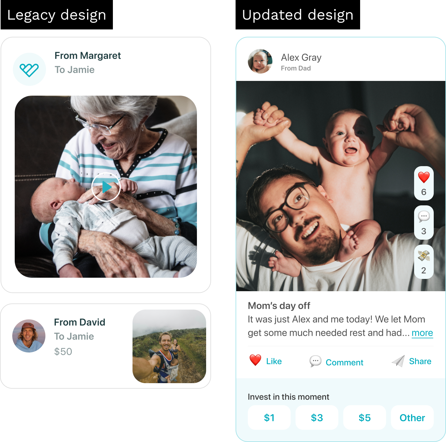
Moments was an evolution of an existing feature called memories. Memories had limited functionality; a user could view the dollar amount of an investment/gift and the attached photo, video, or note. Moments, on the other hand, have an exponential amount of elements compared to its predecessor.
I had the task of integrating a long list of new interactions into the existing UI framework: like, comment, share, interaction counts, and of course, invest. The challenge here is visually balancing each element so that a user is not overwhelmed but still can intuit the hierarchy of content and interactions.
Sharing with friends and family
Parents that engage with moments invest 67% more AUM monthly and are 4x more actively sharing. With the increase of sharing with friends and family, we had the opportunity to create a more engaging experience for givers.
Historically, non-parents could only gift investments to children within the app. To increase giver engagement, we created a desktop experience to view and invest in moments. This allowed a lower barrier of entry for givers who weren’t ready to download the app.
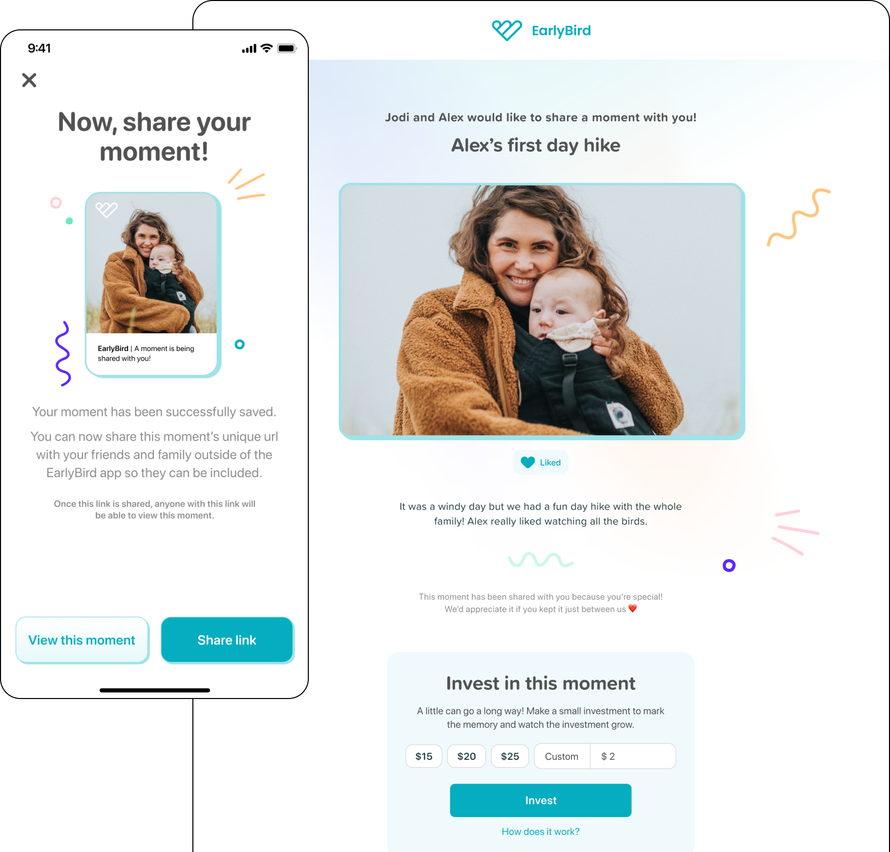
Supporting giving
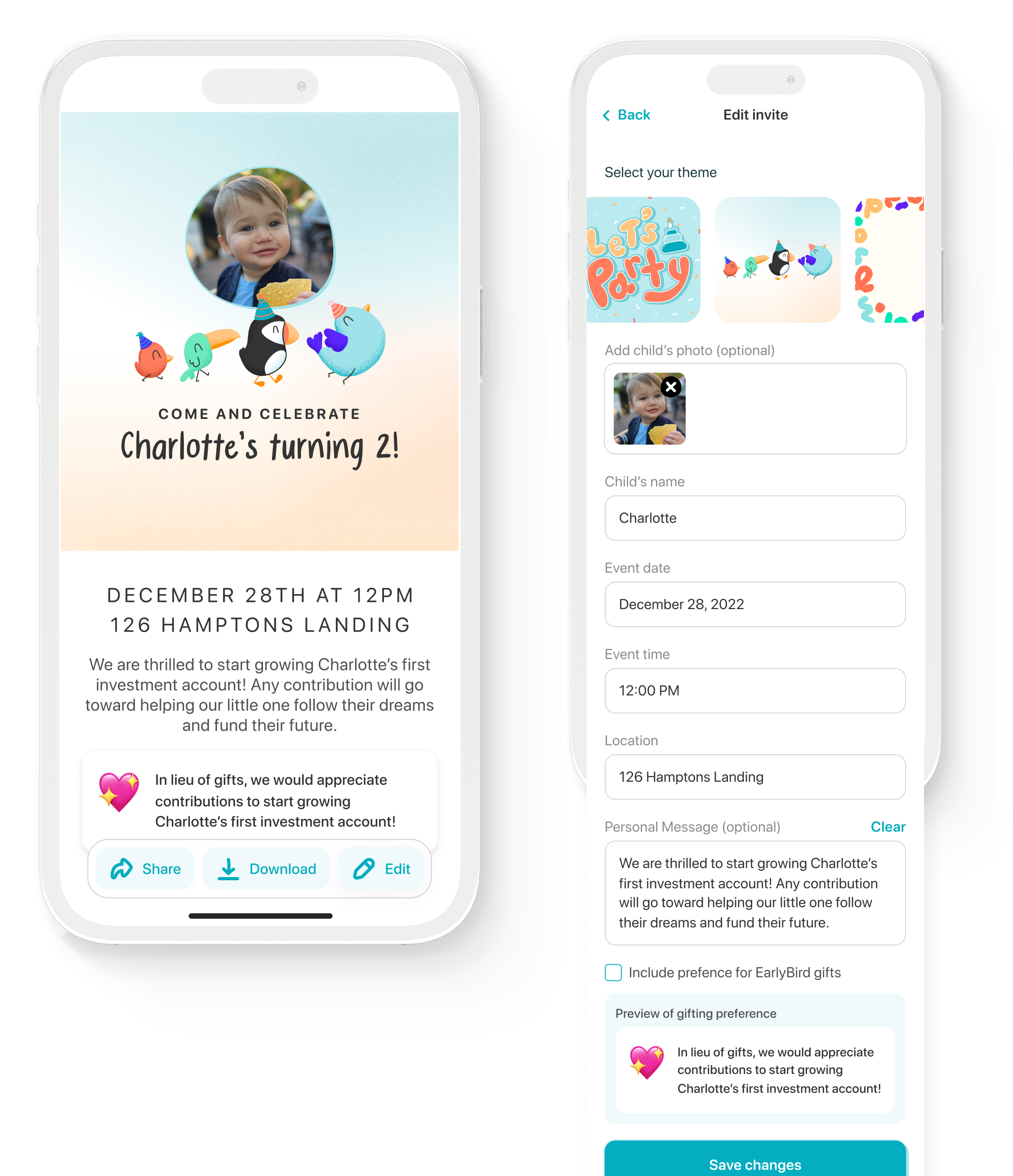
Our research found that parents can be uncomfortable when asking for investments for their children. While we foster a culture of community wealth building, EarlyBird can support the moments that already have gift-giving as a part of them: birthdays.
I collaborated on the art direction for three unique and dynamic invitation designs that included an auto-populated name and birthdate, as well as the option to include the profile photo of their child.
Contributing to the greater team
I am a collaborative team member who seeks to contribute to the team’s success whenever possible. I always keep an eye out for opportunities to improve process efficiencies and organization with the aim to enhance the team’s overall happiness and job satisfaction.
Illustration
With the introduction of Moments, we saw an opportunity to bring a moment of surprise and delight. Up until then, the loading screen while users uploading media had been just a indefinite loading icon. Because we couldn’t reliable provide an accurate representation of loading time with a loading bar, I suggested introducing a enjoyable loading animation – which lead to this happy family of hopping quails.
Sketch and onion skins for animation
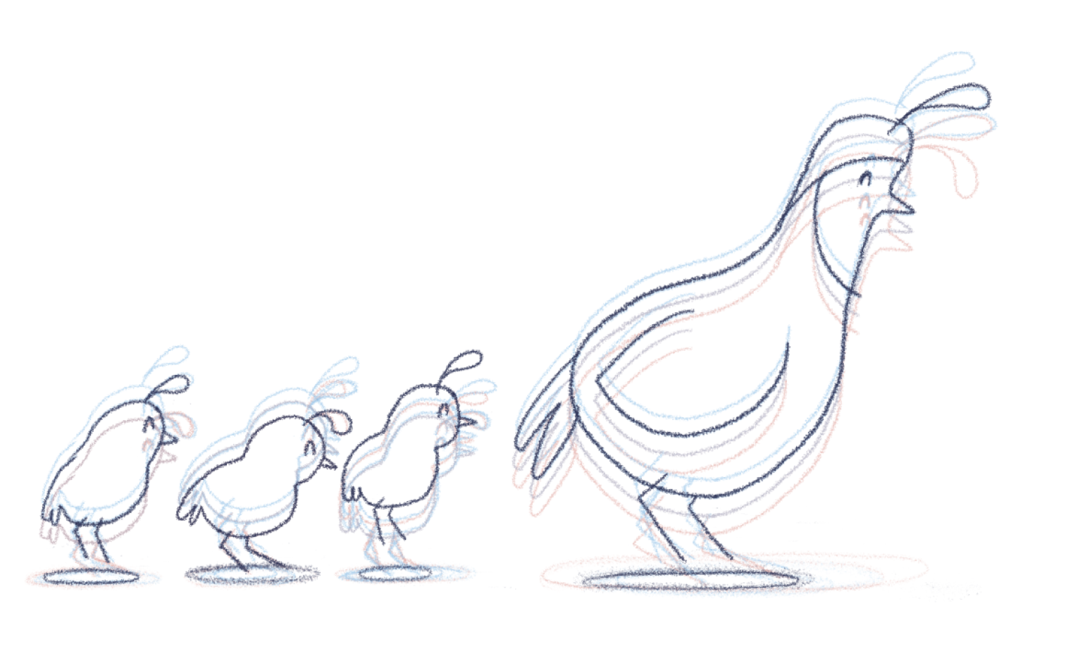
Sketch and onion skins for animation
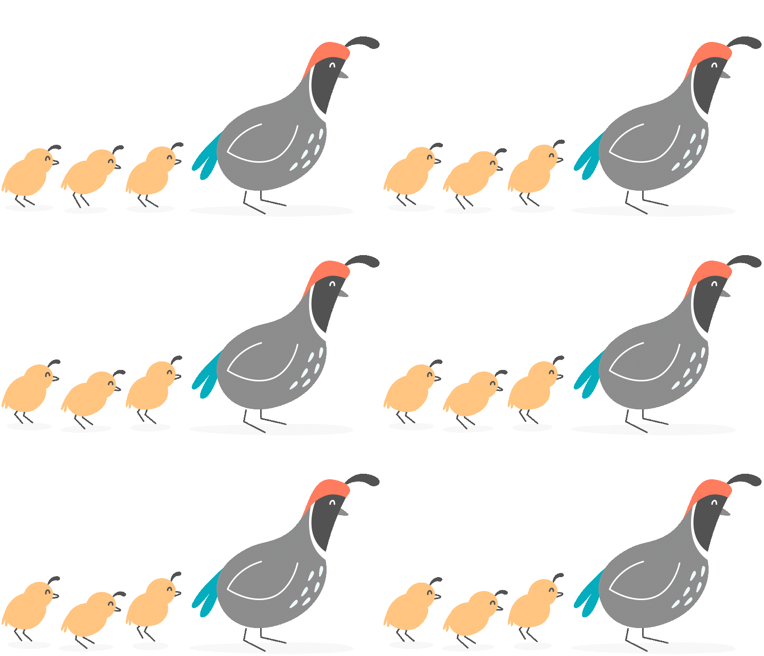
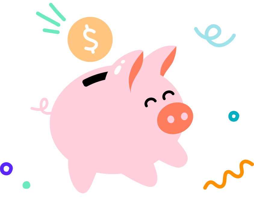
While designing optimizations throughout the app, the legacy illustration style started being referred to as ‘flat’ and ‘dated’ amongst the internal team. Additionally it had been created in a style that proved to be time consuming to replicate in any new illustrations that needed to be made. I collaborated with the marketing design lead to bring to life a new illustrative style that brought more energy to the brand while making it easier to create new illustrations.
Legacy illustration style
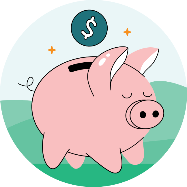
Updated illustration style
The Hatchery 🐣
Off the side of my desk, I cataloged existing recurring design elements and practices in order to start the framework of EarlyBird’s new Design System and Figma component library: The Hatchery. While I worked on new features and optimizations, I was able to update files and designs to all pull from The Hatchery, not only making it easier and faster to design but easier for engineers to pull existing functional and QA’ed code. Creating a repository of patterns that can be reused created a more consistent and cohesive product.
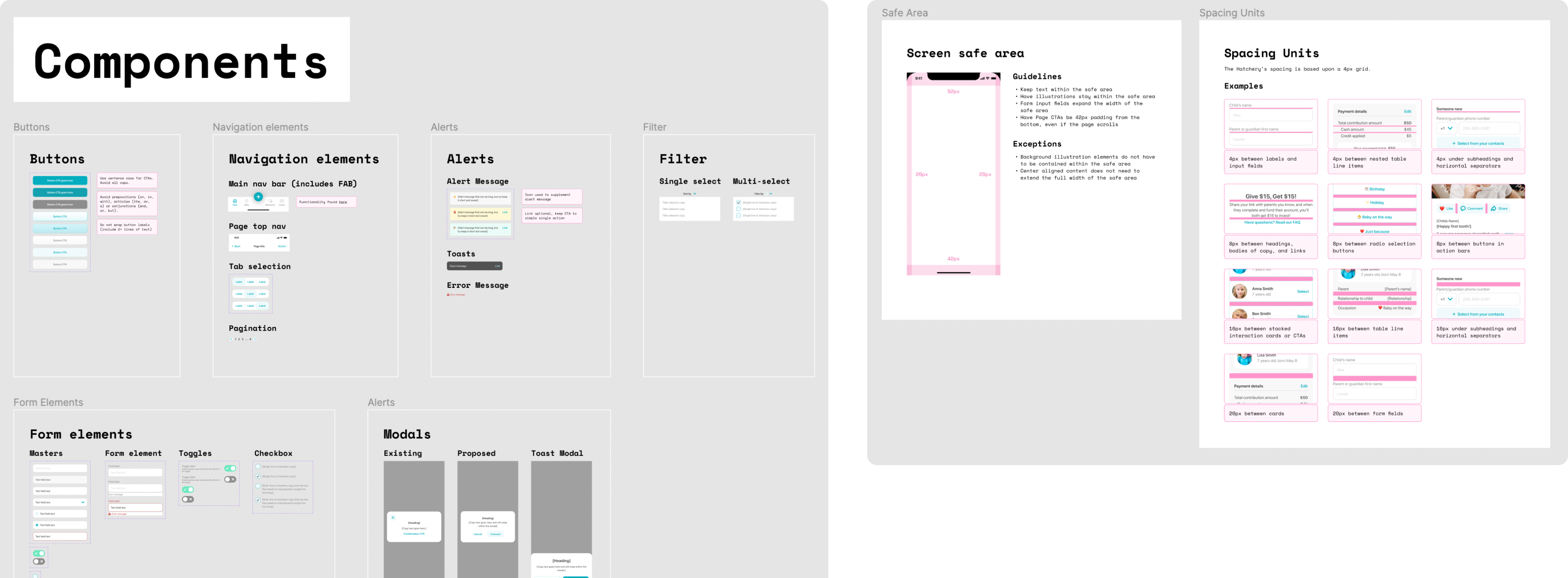
Organization
When I join a team, I look for ways to set myself and my other team members up for success. One of the first things I do is evaluate how effectively their existing file structure is working for them and if there are any updates that could help the work move forward. Since EarlyBird is a young company, when I joined they didn’t have any formalized file structure or documentation process, so I built and implemented a system.
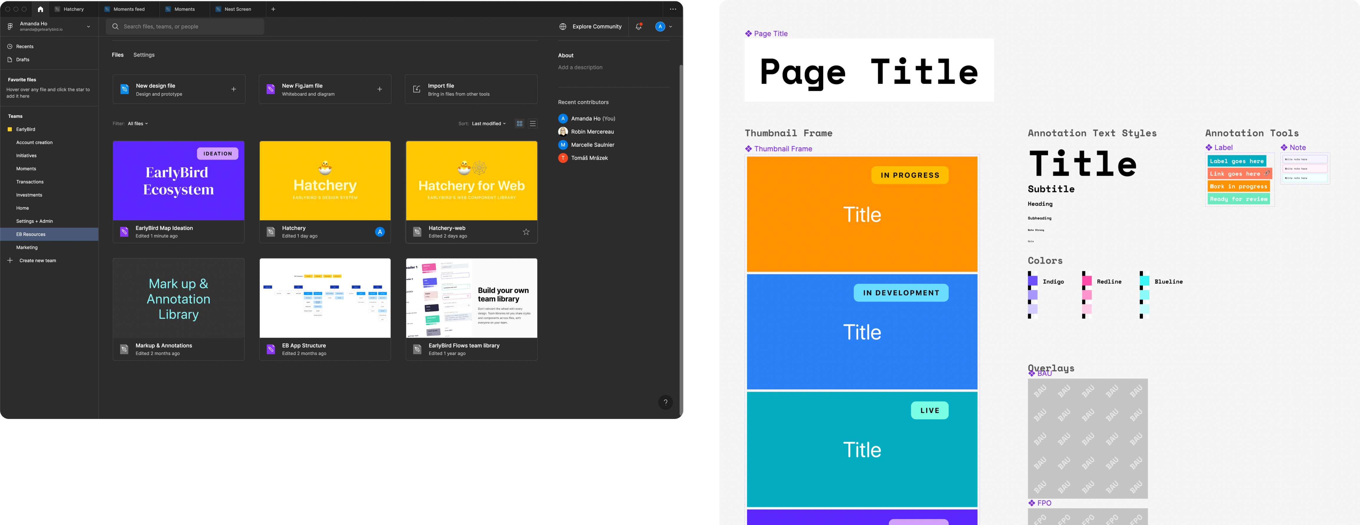
Process building
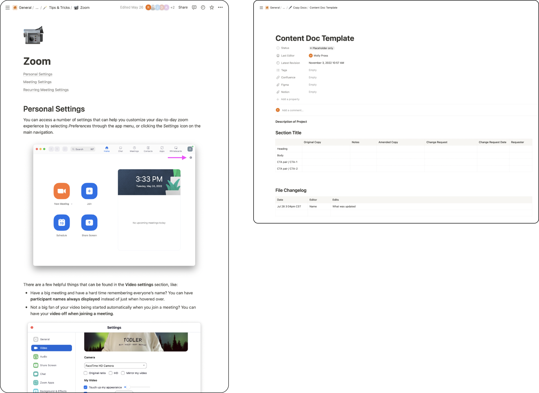
I’m always seeking ways in which I can help my team and other teams find better ways to communicate and work together. When I joined EarlyBird, the team just started using Zoom so I created a document of various tips and tricks to help everyone get more familiar with the new tool.
I also discovered that EarlyBird had been operating without copy docs, making content proofing, editing, and finalization a complicated process that created opportunities for repeat efforts and confusion. Since I had worked with copy docs in the past, I created a database and documentation template for the team.
